Themes
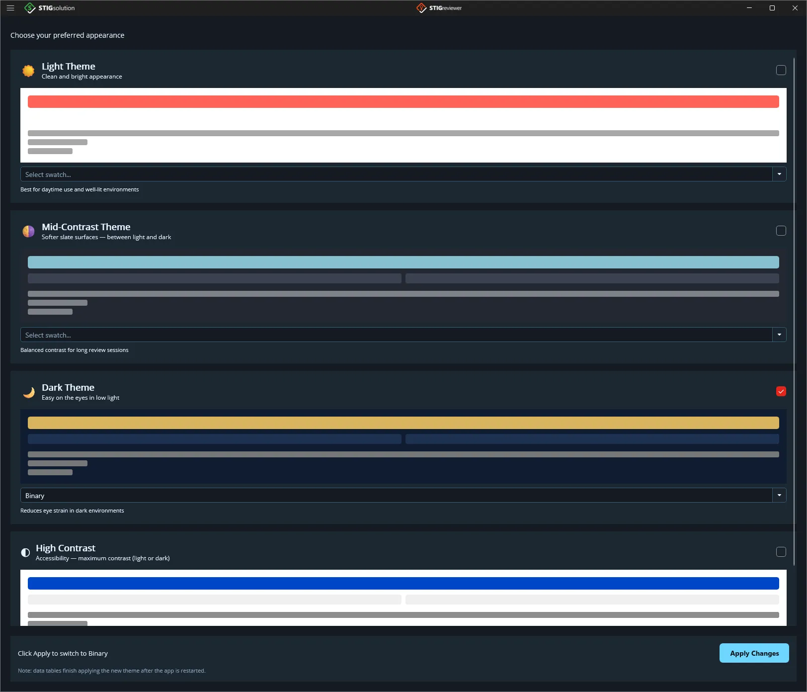
STIGreviewer ships with a number of themes across four categories: Light, Dark, Mid-Contrast, and High Contrast. You can choose your preferred theme either from the Theme drop-down at the bottom of the flyout or from the Theme Settings page.
Available themes
Section titled “Available themes”Each theme includes both a light or dark base and a family of swatches. Pick the family that matches your working environment; then pick a swatch inside that family.
Best for daytime use and well-lit environments. Default: Harbor. Swatches: Harbor, Harbor Bold, Daybreak, Clarity, Graphite, Blueprint, Overcast, Celadon.
Dark (Stellar family)
Section titled “Dark (Stellar family)”Reduces eye strain in dark environments. Default: Pulsar. Swatches: Pulsar, Binary, Comet, Ion, Solar, Nebula, Helios, Aurora, Antares, Corona, Singularity. Additional standalone dark swatches: Frost, Star Fleet.
Mid-Contrast
Section titled “Mid-Contrast”Softer slate surfaces sitting between light and dark. Balanced contrast for long review sessions. Swatches: Fjord, Crimson Command, Azure Command, Verdant Command, Amber Command.
High Contrast (accessibility)
Section titled “High Contrast (accessibility)”Maximum-contrast themes for low-vision use (WCAG AA). Swatches: High Contrast Light and High Contrast Dark.
Using the Theme Settings page
Section titled “Using the Theme Settings page”The Theme Settings page has one card per family — Light Theme, Dark Theme, Mid-Contrast Theme, and High Contrast. Each card shows a preview and a swatch picker. Beneath the cards is an Apply Changes button. To use it:
Open Theme Settings from the flyout.
Tick Light Theme or Dark Theme, then pick a swatch from the drop-down underneath it.
Click Apply Changes at the bottom. The new theme takes effect immediately and is remembered the next time you start the application.